Minimalism with Personality
Modern logos and design rely heavily on simplification of everything. This site being one of the examples. I do like a minimalistic design. But when it comes to uniqueness and personality of something, things turn a different way. The more minimal we go the more general and bland it gets. It'll lack the personality of it to show it's difference from others. While a maximalist approach would include tiniest of details to make it more unique and personal than ever, a minimal design would take some very clever tricks to achieve uniqueness.
This site is directly inspired by manu's site but I wanted to add my own touch to it as he also has given to it. I wouldn't say his site lacks personality because I loved the design and the minimalistic approach of his site that I wanted one for myself too. But, to make my site more personal and unique in itself I added a handwriting style text for my inner voice inner voice... inner voice... for the things I think while writing.
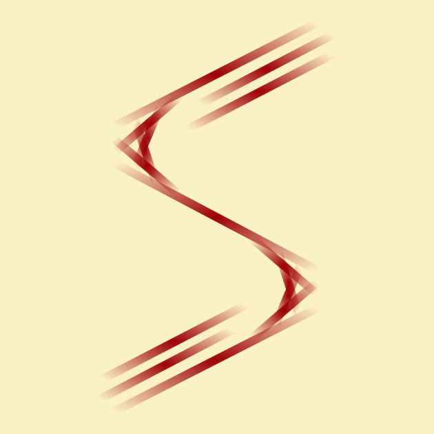
Take a look at this logo. It is made up of completely straight lines. It's minimal as well as unique. This is scientiac's logo and he talks about it whenever he gets the chance to. He is very proud of it.
But, thinking about personality, I sometimes wish that apples were rainbow colored and the window glasses were tinted with colors.
A colorful place for colorful minds.
But, ("but" strikes back) I love a good minimalist approach of things. I like the new mozilla logo. I like the fact how the new Pepsi's logo look and yes I do love GNOME's foot. (Wouldn't call it a fetish though. XD)
Because they have their quirks and their own personalities.
